Showing posts with label keithisgood. Show all posts

Friday, August 19, 2016

First Lines

Works of fiction often come to be known by their openings. "Call me Ishmael." "It was the best of times, it was the worst of times."

In that spirit, I'm posting the opening lines of my various short story and novel manuscripts. Today we have:

"We’re all transparent. Hold your hand up to a light. Doesn't it make you anxious? Our bones and veins and organs, it’s just fruit suspended in strawberry jello. A bright enough light and our insides glow, a neon sign, open."

Although the story is by no means done, the opening paragraph, the spark which drove me to write this story down, originally began as follows:

"It's strange. Hold your hand up to a light. There are the bones, shadows swimming in red pink jelly. Veins like neon.That we can see through so easily. Guess that's what X-rays are. Just powerful light. Light bouncing and projecting, the world always a fraction of a second in the past. Maybe the whole thing is just a projection; theory that we’re all just holograms projected on dimensions of spacetime beyond perception."

Who knows what the next month will change.

Monday, August 15, 2016

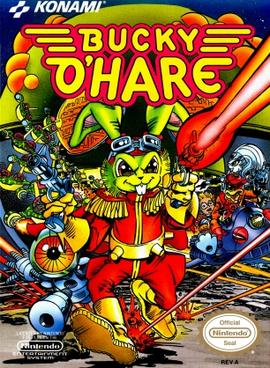
8-Bit Encyclopaedia: Bucky O'Hare


Bucky O'Hare hit the NES in January of 1992 to almost zero fanfare. Developed by Konami, Bucky O'Hare drowned in the wake of Nintendo's newly-released 16-bit Super NES console. Gaming fans were too busy with Super Mario World and F-Zero to care about a green-furred, epaulet-wearing space rabbit.

Bucky O'Hare: the NES's
only hero with epaulets!
Bucky also suffered by association. Two out of every three NES games released in 1992 were either sequels or adaptions1. Much like Hollywood does with today's blockbuster films, NES game developers turned to pre-existing intellectual properties as a way to hedge potential losses in an increasingly competitive home gaming market.

The NES had mixed success with adapted properties. Turds like Back to the Future, The Simpsons: Bart vs. the Space Mutants, Fester's Quest (the Adams Family), Jaws, Top Gun, Die Hard and Hudson Hawk stunk up store shelves. The Bucky O'Hare comic and cartoon were themselves seen as derivative of Teenage Mutant Ninja Turtles. For all intents and purposes, Bucky O'Hare looked like Konami's last attempt to cash in before the NES died.

But let's remember, this is Konami, developers of Castlevania, Contra, TMNT II, Metal Gear and Tiny Toon Adventures. Books shouldn't be judged by their covers2. Bucky O'Hare is one of the best run 'n' gun platforming games on the NES console.

Wednesday, March 9, 2016

Billy Beane Buys a Sandwich

Below is a lovely snippet of my latest work over at TheSpitter.com, a David Ives-ian look at baseball's fascination with Moneyball:

Billy Beane Buys a Sandwich

A Play in One Act by Keith Good

(Lights up; the scene is frozen. A Baker stands in an apron and toq behind a “Sandwich” counter in the O-Co Coliseum. Oakland A’s General Manager Billy Beane is standing before the counter. Very serious. OPS Machine Scott Hatteberg and Pete the stats geek browse the soft pretzels. Pete is looking at Billy Beane. They stand in tableaux, a moment of stillness.)
PETE. Is that…Billy Beane?
HATTEBERG. I think so. (Hatteberg turns and looks)
BAKER. Can I help you sir?
BEANE. I need a loaf of bread, please.
BAKER. We usually sell sandwiches, Mr. Beane, but if you want…
PETE. It’s time now.
HATTEBERG. I should go. (But they don’t move. Billy turns and looks at Hatteberg. They look in silence at one another, frozen.)
BAKER. Do you know that man? (A bell rings. The lights change.)
BEANE. (Dreamily) He gets on base a lot. Do I care if it’s a walk or a hit? If ever they make a movie about how I assemble personnel—
BAKER. They did make a movie—
BEANE. Hatteberg would be emblematic of my frugal, analytic-driven baseball.

To the small slice of Venn Diagram between "Theater Geek" and "Baseball Analytics Nerd," READ THE REST AT THESPITTER.COM!

Tuesday, December 8, 2015

Browns Reach Apathy-Level Awfulness

Cleveland Browns:Professional Football::Tang:Orange Juice.

At this point, Cleveland shouldn't be calling themselves a "Football Team," so much as a "American Football-styled Sports Franchise." Some pundits want the head coach fired. Other talking heads yip and yap about a bumbling General Manager or a crooked owner. In response to all this I can only say the following:

Do whatever you want, Cleveland, because it's difficult for me to find a flying rat's tail to give anymore.

Monday, September 14, 2015

First Lines

Just another in a series I'm starting; taking a look at that first spark that puts my pen (UniBall Signo 207 or bust) to paper and gets the ink flowing. Perhaps I'll revisit these once I win a Hugo or Pulitzer...or five.

I should say this draft is also singular in that, instead of putting paper to pen, this one was thumb to touchscreen: this was drafted entirely on a smartphone using Google Docs. Appropriate, given it's nature.


"It's not so bad as it sounds, being your refrigerator's pet."


So what do you think? Hooked? Left cold? What story would you expect this line to belong to? Feel free to comment below.

Sunday, September 6, 2015

8 Bit Encyclopaedia - Ninja Gaiden 3


What's behind your back?
Sometimes, you beat a video game and watch the credits with a silent swell of satisfaction. Sometimes, you beat a video game and shout obscenities as the boss disintegrates into pixels and then run around the room blasting the double-bird at the dead bastard. Ninja Gaiden III: The Ainceint Ship of Doom1 falls into the latter category.

Tecmo released Ninja Gaiden III to Japan in late June of 1991 and in America a few months later. Anyone familiar with the game's more popular forebears knows the routine: Ninja Ryu Hayabusa runs and jumps through screen after screen of perilously-placed baddies, slashing everything with his dragon sword. Along the way he collects magical power-ups such as spiraling fireballs and ninja stars. The game reveals plot through cinematic cut-scenes2.

Ninja Gaiden III makes small tweaks to this formula. First, Ninja Gaiden III gives Ryu the ability to hang down from and crawl under certain platforms. It's a nice change and allows for more variety in level design. The game's powerup pods also kindly show the prizes within. Opaque pods in previous Gaiden titles often saw Ryu slashing a pod and receiving an unwanted sub-weapon3. Ninja Gaiden III also makes minor adjustments to game physics. Compared to Ninja Gaidens I and II, Ryu jumps smoother and farther.
Ninja Gaiden (1989)
Ryu jumps 4 body lengths
Ninja Gaiden III (1991)
Ryu jumps and floats 4+ body lengths
There's a plot in Ninja Gaiden III but it's terribly contrived and not really worth much mention. The opening cinematic shows Ryu's girlfriend falling from a cliff to her doom, pushed by...[gasp] Ryu! Accused of murder, Ryu quests to clear his name, stumbling onto a vast government conspiracy of clones, genetic experiments and inter-dimensional evil. It's a pity the game falls into such vanilla Anime tropes, as the first two Gaiden games had decent plotting and character development. Here? Not so much--just shut up about plot and go slash some stuff!


Monday, August 17, 2015

First Lines

Juleah's term paper came back unsullied by editorial red, save the obese F and a terse, slanting note:
"Well-written (no surprise) but factually ignorant. Next semester, consider actually reading your father's novel."

So, is this a gripping line? Is it Kafka's axe, smashing the frozen sea? Or just a herring trying to cut down a tree? Feel free to let me know.

Tuesday, February 24, 2015

Evolution of the "New" Cleveland Browns Logo

Looks like Jimmy Haslam III learned how to use MS Paint's paint bucket tool. The hype around the Cleveland Browns New Logo is perhaps the greatest trolling of Cleveland since LeBron's "Decision."

Wednesday, February 18, 2015

Myself, in a Single Page

It's the ultimate exercise a human can undertake (next to soccer): trying to fit all pertinent, marketable information about oneself onto a single page. 

I think a common mistake is thinking pertinent information must take the form of text. People squeeze the margins small enough to make a Lilliputian feel claustrophobic and then splash their entire life's history in black monoliths across the page. Exhaustive? Yes. Exhausting? Also yes.

Information can be textual and contextual. Typefaces (here Cubano and Georgia) can give pertinent information. Cubano has a fun roundness which is counterbalanced by "Serious Writer" Georgia. Spacing and layout most definitely give pertinent information. And although color can be risky, ecru and green (a specific shade I call, "keithisgreen") mirror the websites I list in the contact section to create a cohesive (although I shudder to say it) brand. 

Especially when applying for creative jobs, a stock MS Word template chock-a-block full of 10pt word vomit constitutes a sin above all others. Would this exercise in resumosity (it's a word now) work for Banking or Construction? Probably not. 

Phone info blurred because, "You want digits? Eff you, digits are for closers."And I was very close to listing "Big Lebowski Quotations" and "NES Ephemera" in the Skills word cloud.


Wednesday, January 14, 2015

Friday, August 22, 2014


I saved for months to buy Journey to Silius. Months of allowances, birthday money, and couch quarters clutched in my fist, I strutted into Babbage's 1 a financial titan and strutted out with an awesome new NES game. There's a solar eclipse AND robots on the cover--how could it not be awesome?!2

I could have cried. The game--purchased with hard-earned monies--was harder than Ron Jeremy's... rock collection. The protagonist's teensy pop gun barely dented the cybernetic horde. I played Silius twice, never passing level 1, before putting it away for good.

I'll Be Back... Under a different name
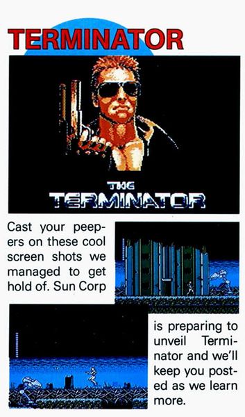
The irony is that Journey to Silius, the greatest failure of my young life, is a decent game. Developed by Tokai Engineering and released by Sunsoft in 1990, the game's difficulty is owed to its hectic, meandering development process. It started life not as a generic, platforming shoot 'em up, but as... The Terminator. Nintendo Power published the snipped at left in July of 1989.

It doesn't take CSI: Miami to see Nintendo Power's screenshots match Silius' box art. Most likely due to the prohibitive cost of obtaining movie licenses, Sunsoft dropped the in-progress Terminator title and re-worked the game into Journey to Silius. The Terminator's fingerprints3 remain all over Silius, but none more prominently than the unused graphics (below) still in Silius' game's code:

Thursday, August 7, 2014

Handlebars 'n Pillboxes

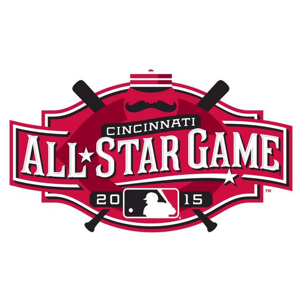
Yesteday, the Cincinnati Reds unveiled the 2015 MLB All-Star Game logo:
Compared to Minnesota's 2014 blah-gasm1, Cincinnati's logo is 100% uncut AWESOME. First off, it actually says "Cincinnati." Excepting those with expert knowledge of the Twin Cities' skyline, Minnesota's logo looked like a snapshot from Cloud City. Even better, Cincinnati hearkens back to it's heritage as MLB's first pro team with the inclusion of old-timey handlebar moustaches and pillbox caps.

This got me thinking2: What if every logo was as awesome as the Cincinnati All Star Game Logo? The answer, as shown below, is VERY.

Is anything as classy as pillbox caps and BMW? I
submit that there is not.

PBR seemed all too eager to don the Handlebar.
Damn hipsters.
If you were sexually confused looking at the naked mermaid
on your latte before, it's only going to get worse from here.

MORE MOUSTACHES, I SAY!


1Seriously, what is that thing? An airplane? The visual manifestation of a Blatz-smelling yawn?
2A dangerous pastime, I know.

Thursday, April 24, 2014

Baseball Simulator 2014

We've only just released the game and he's
already Puiging.

It's Finally Here! Baseball Simulator 2014 updates Culture Brain’s Baseball Simulator 1.000 with 18 current MLB teams:

• Boston • Detroit • Cleveland • Atlanta • San Francisco • Washington • Texas • Kansas City • New York (A) • Los Angeles (N) • Cincinnati • Pittsburgh • Tampa Bay • Oakland • Baltimore • Arizona • San Diego • St. Louis

6 additional teams can be introduced via the in-game “Edit” function. The game’s default “Edit” teams (pre-loaded via a .sav file included in the archive) are:

• Los Angeles (A) • Seattle • Toronto • New York (N) • Milwaukee • Colorado

Look at those, sweet,  pixelated logos.
LOOK AT THEM!
Teams were chosen for the BBSIM14 roster based on their 2013 record (sorry Cubbies and Marlins, no soup for you). Previous releases also contained data for the remaining MLB teams. This year, to maximize available batters, this data is omitted. However, logo data for all 30 clubs exists in the rom, so any super-enterprising Miami fan could theoretically add Christian Yelich and Co. into the game if they really wanted.

McCutcheon v. King Felix: Doesn't get
much better than that.
Projected rosters, stats and PITCHf/x data from rotochamp and fangraphs.com; current as of 2014-04-23. An improvement from BBSIM2013, this year's release uses Sabermetrics to better depict players' abilities. For example, instead of .SLG representing a player's raw power, this release uses ISO. wOBA is used to dictate how big of a "sweet spot" each batter gets. And for the pitchers, pitch speeds, as well as lateral and horizontal movement are pulled directly from PITCHf/x data.

Like Baseball Simulator 2013, all teams have Ultra points for special abilities. Only the most clutch players, though, get special hits/pitches.

Papi's stat line looks wicked pissah.
The archive linked below includes a number of goodies. First and foremost, you get the rom, son. "Baseball Simulator 2014.nes" is tested and compatible with any number of NES emulators. Also in the archive is "Baseball Simulator 2014.sav" Copy this .sav file into the sav folder of your emulator to pre-load 6 more MLB teams via the game's Edit function. Also in the archive is the complete stat sheet for every team in the game and the Hacking Bible, should anyone want to make personal tweaks. 

DOWNLOAD BASEBALL SIMULATOR 2014 - THE ONLY NES BASEBALL GAME THAT MATTERS - HERE 
(upaded 2014-04-29 to include corrected .sav file)

After you've crushed your competition, tweet out screenshots and scores using the hashtag #BBSIM14. And although the game has been tested, some things slip through the cracks. Tweet @keithisgood with any bugfix requests or statistical oddities. PLAY BALL!

Monday, April 7, 2014

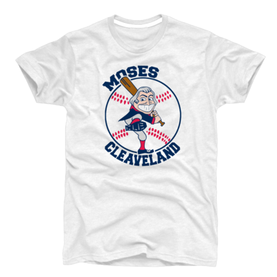
The Moses Cleaveland Tee

I know you've been waiting with bated breath. At long wait, in time for the start of the (World Series-winnin?) 2014 Cleveland Baseball season, the Fightin' Moses T-Shirt! Big thanks to our partners in this venture, TeamCLE tees.

Purchase one (or twenty!) here: 


Wednesday, April 2, 2014

Baseball Simulator 2014

A little behind schedule this year, but...
soon.

Monday, March 10, 2014

No Wahoo Cleveland Baseball Uniforms

After re-working a Cleveland Baseball logo should Chief Wahoo ever go the way of the dodo, the next logical step would be a uniform employing said logo. Again, I've worked on this previously. This iteration keeps Cleveland's current Block C logo--boring as it may be--and incorporates various other elements drawn from Cleveland's city flag.


Tuesday, February 25, 2014

Building A Sticky Brand


Imagine walking into a club, down foot-bowed steps to a little cellar, long bar stretching down the left wall. Music pulses up from below: jangly, fast, instantly recognizable but somehow new. At the bottom step the sound gels into a bouncing cover of Madonna's Like a Virgin. You turn to see a 4-piece band injecting life into the pop classic. Above them hangs a pink, navy and white banner emblazoned with sticky hands. The Sticky Bandits. Hm. The whole scene just screams "fun."