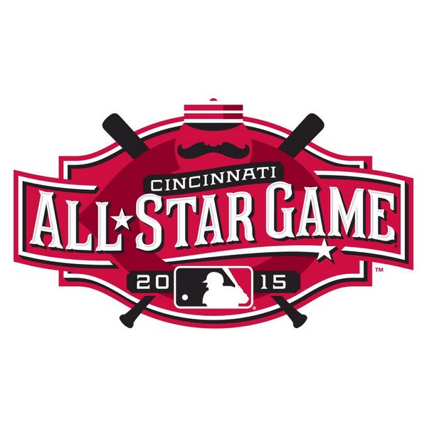
Compared to Minnesota's 2014 blah-gasm1, Cincinnati's logo is 100% uncut AWESOME. First off, it actually says "Cincinnati." Excepting those with expert knowledge of the Twin Cities' skyline, Minnesota's logo looked like a snapshot from Cloud City. Even better, Cincinnati hearkens back to it's heritage as MLB's first pro team with the inclusion of old-timey handlebar moustaches and pillbox caps.
This got me thinking2: What if every logo was as awesome as the Cincinnati All Star Game Logo? The answer, as shown below, is VERY.
 |
| Is anything as classy as pillbox caps and BMW? I submit that there is not. |
 |
| PBR seemed all too eager to don the Handlebar. Damn hipsters. |
 |
| If you were sexually confused looking at the naked mermaid on your latte before, it's only going to get worse from here. |
 |
| MORE MOUSTACHES, I SAY! |
1Seriously, what is that thing? An airplane? The visual manifestation of a Blatz-smelling yawn?
2A dangerous pastime, I know.

No comments:
Post a Comment