
Tuesday, January 22, 2013
Friday, January 18, 2013
The 2013 NFL (Uniform) Playoffs - Championship Round
AFC CHAMPIONSHIP
 AT
AT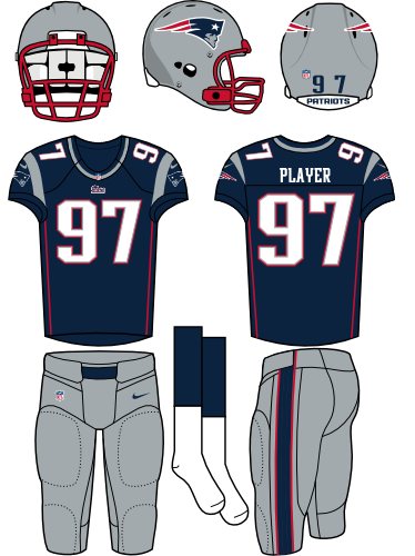
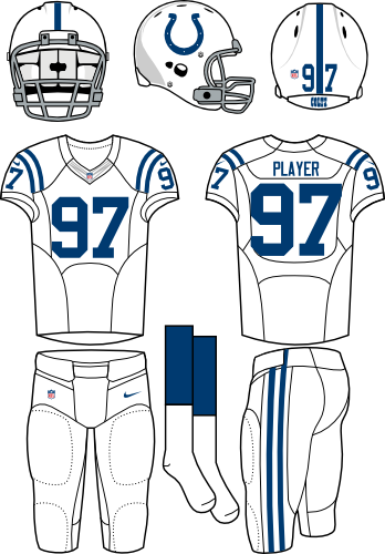
What is this, 2004? Indy and New England? Indy arrived here by being cleaner than Baltimore's dirty-bird attire and less annoying than Denver's kit. New England just barely escaped the black hole of awful which ate Cincinnati and Texas. This match up is traditional minimalism vs. sleek modernism. I love the simplicity of the Colts' uniforms, but leave with the feeling it needs that dash of je ne sais quoi. A splash of accent color, perhaps? In the end, Indy is just too plain for this match up. The Patriots flat-out look better.
Wednesday, January 16, 2013
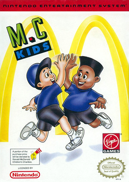
Baseball Simulator 2013 Box Art

Here's to hoping Baseball Simulator has Madden-Curse Powers and Miggy slumps below the Mendoza line this year...
Friday, January 11, 2013
The 2013 NFL (Uniform) Playoffs - Divisional Round
It would seem picking game winners based solely on uniform aesthetics is no dumber than any other prognostication method. Last week a supermassive black hole of uniform atrocity ate both Cincy and Houston. So excepting New-Cleveland triumphing over Old-Baltimore in the battle of dirty, no-good, team thieves, last week's predictions went 2-for-3 (and that ain't bad). That said, its on to...
AFC DIVISIONAL GAME # 1
AT
Last week, Indy's uniforms reigned supreme over the dirty birds (Their team? Not so much). This week then finds Colt Blue facing Bronco Orange. When Denver introduced its new uni set in the 90's, its modern design represented a complete departure from the norm. The convening years, however, have seen a number of teams ape the Brocs with varying degrees of success (YAY!-Seattle; BOO!-Cincinnati). The once-revolutionary design now seems ho-hum. That and Denver's garish orange color are why I say Indy has the better uniform.
Thursday, January 10, 2013

Monday, January 7, 2013

 |
| That's a clown game, bro. |
Developed by Virgin Interactive and released Stateside in February 1992, M.C. Kids (titled "McDonaldland" in Europe) follows two kids--Mick and Mack--as they try to retrieve Ronald McDonald's stolen magical bag.

Seeing only screenshots like the one to the left, most dismissed the title as shill for hamburgers and french fries. Honestly, it's hard to fault this snap judgement; M.C. Kids, like so many product tie-in games (I'm looking at you Barbie and Muppets), looks cheap. The sprites, shown in the header above, are monochromatic and blocky compared to Mario and Luigi. And McDonald's golden arches are literally on every screen of the game.
 |
| Much better, right? |
So. Let's hit the reset button...
Saturday, January 5, 2013
The 2013 NFL (Uniform) Playoffs - Wild Card Round
AFC WILD CARD # 1
 AT
AT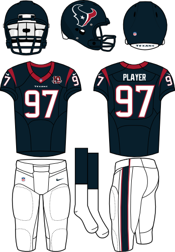
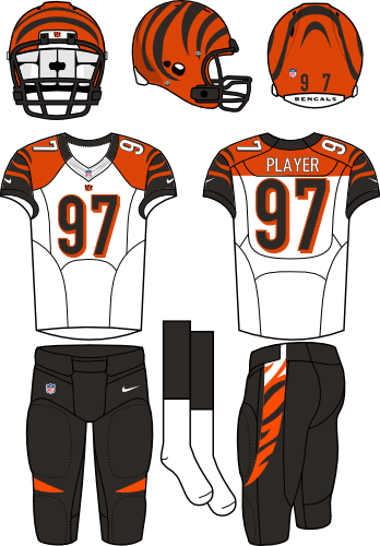
Ugh. Cincinnati's set is the definition of 'costume-ish.' The clown getup seemed apropos when Ochocinco and TO patrolled the sidelines, but it now seems dated. Gradated white/orange/black leg stripes and garish shoulder yokes ice this craptacular cake. The Houston Texans' uniforms, on the other hand, look like a Chinese knock-off of the Patriots uniforms. They're boring to the nth degree, having all the flavor of cold gruel. No winner here, only losers.
Subscribe to:
Posts (Atom)