It would seem picking game winners based solely on uniform aesthetics is no dumber than any other prognostication method. Last week a supermassive black hole of uniform atrocity ate both Cincy and Houston. So excepting New-Cleveland triumphing over Old-Baltimore in the battle of dirty, no-good, team thieves, last week's predictions went 2-for-3 (and that ain't bad). That said, its on to...
AFC DIVISIONAL GAME # 1
 AT
AT
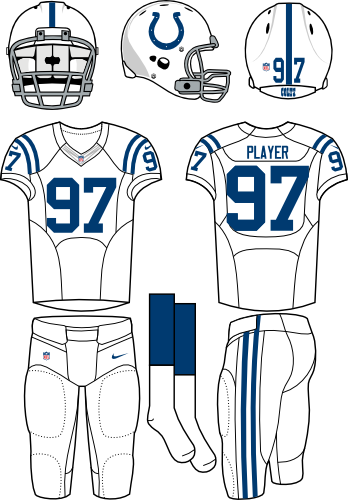
Last week, Indy's uniforms reigned supreme over the dirty birds (Their team? Not so much). This week then finds Colt Blue facing Bronco Orange. When Denver introduced its new uni set in the 90's, its modern design represented a complete departure from the norm. The convening years, however, have seen a number of teams ape the Brocs with varying degrees of success (YAY!-Seattle; BOO!-Cincinnati). The once-revolutionary design now seems ho-hum. That and Denver's garish orange color are why I say Indy has the better uniform.
NFC DIVISIONAL GAME # 1
 AT
AT
This might be the toughest match-up of the entire playoffs. Both uniforms (barring slight color/design tweaks) look much as they did in the 50's. Also, if you remove the colors and logos, Green Bay and SF wear basically the same set. Therefore color is king here. Can't pick against the 49ers' gold and red
AFC DIVISIONAL GAME # 2
AT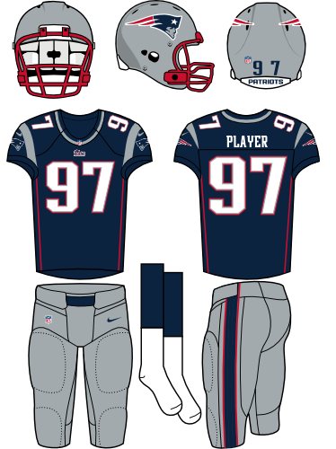
 AT
AT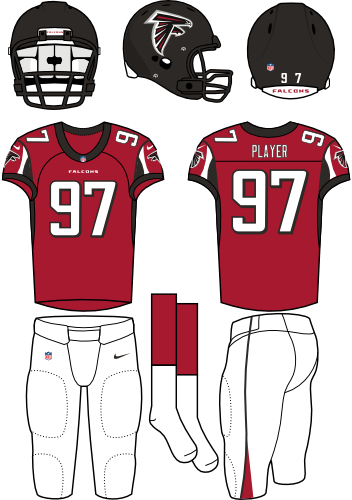
Hmm. I said GB vs SF was the toughest match up, but this a close second. Do I pick New England or no the vacuous nothing which ate Cincinnati and Houston? The Pats' uniforms actually aren't bad. They have a nice retro-modern thing going. The color scheme, while far from revolutionary (Red, White and Blue? WHOA!), works well. Although I long for Pat the Patriot to revivify and smite Flying Elvis, I begrudgingly choose the Pats over the eternal abyss.
NFC DIVISIONAL GAME # 2
AT
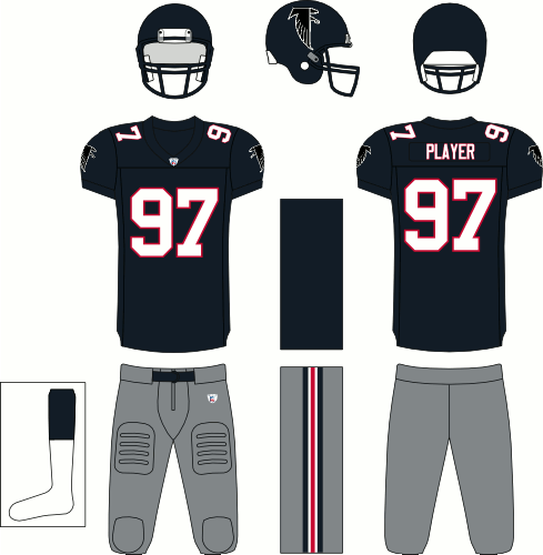
It seems Atlanta wanders the vast diaspora of bland uniforms. They feel like a team without identity. Red, black and white: whoop-de-do. The logo is equally ho-hum, with the overall design trapped in the nexus between modern and classic without excelling at either. Seattle's tight, chohesive design wins in a landslide.
We're down to the nitty gritty now. Indy, New England, San Francisco and Seattle. The four remaining teams are an interesting mix of old and new. Good thing I have a week to mull it over.
We're down to the nitty gritty now. Indy, New England, San Francisco and Seattle. The four remaining teams are an interesting mix of old and new. Good thing I have a week to mull it over.
No comments:
Post a Comment